
Free PDF
Get the checklist as a printable PDF
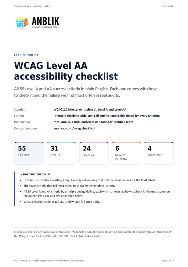
This WCAG checklist as a printable PDF: the same 55 WCAG 2.2 Level AA criteria as this page, laid out one card per criterion with how to check it, the most common failure, and Pass, Fail and Not applicable boxes. The PDF is tagged, so it reads properly with a screen reader. Enter your name and email address and the download link is sent to you straight away.
The link arrives by email within a minute or two. Your details are handled as described in the privacy policy and are never shared.
Before you start
How to use this WCAG checklist without wasting a day
Do not start at 1.1.1 and work down. Start with the seven criteria that account for most real failures, then widen. Most of what follows needs only a keyboard, your browser and your eyes. The W3C's How to Meet WCAG 2.2 quick reference holds the normative text behind every card here.
Test templates, not pages
A thousand product pages share one template. Pick one example of each distinct layout: home, listing, detail, form, cart or enquiry, account, article, search results and error pages.
Unplug your mouse first
The single most revealing test. Tab through a whole journey. If you cannot reach something, cannot see where you are, or get stuck, you have found a Level A failure before opening any tool.
Then zoom to 400 percent
Set the browser to 400 percent at a 1280 pixel width. Content should reflow into one column with no horizontal scrolling and nothing cut off. This finds a surprising number of layout failures quickly.
Automated tools last, not first
Run axe or WAVE after the manual pass, to catch what you missed. They reliably find about a third of failures, and a clean report on an unusable page is common.

The checklist
Level AA criteria, by principle
Open a section to see its criteria. All 55 Level A and AA criteria of the current release, WCAG 2.2, are here in numerical order. Each entry gives the plain meaning, how to check it, and the failure I find most often in real audits.
Perceivable: 20 criteria
1.1.1 Non-text Content (A)
Every image, icon and control that is not text needs a text alternative that conveys the same information.
How to check: Turn images off, or read the alt attributes. Ask whether somebody hearing only the alt text would learn what the image tells a sighted reader.
Most common failure: Decorative images given long descriptions while meaningful product photos carry the SKU as alt text.
1.2.1 Audio-only and Video-only (Prerecorded) (A)
A recorded podcast needs a transcript. A silent video needs a transcript or an audio track that tells the same story.
How to check: List every audio-only and video-only file. Look for a transcript link next to each one and read it against the recording.
Most common failure: A podcast page with an embedded player and show notes, but no transcript of what was actually said.
1.2.2 Captions (Prerecorded) (A)
Recorded video with sound needs synchronised captions.
How to check: Play each video and turn captions on. Auto-generated captions count only if they are accurate and punctuated.
Most common failure: Auto captions left uncorrected, so names and technical terms are wrong.
1.2.3 Audio Description or Media Alternative (Prerecorded) (A)
If a recorded video shows information that is not spoken, provide either audio description or a full text alternative that describes it.
How to check: Watch with the screen off. If you lose information, look for an audio-described version or a text alternative that covers what was shown.
Most common failure: Screen recordings and demos where everything important is shown but never said aloud, with no transcript that describes the screen.
1.2.4 Captions (Live) (AA)
Live video with sound, such as a webinar or a streamed event, needs live captions.
How to check: Join a live session as a viewer and switch captions on. Check that they follow the speech closely enough to be useful.
Most common failure: Live webinars run without captions, with the recording captioned days later.
1.2.5 Audio Description (Prerecorded) (AA)
Recorded video needs audio description of the visual content that matters. At AA a text alternative alone is not enough.
How to check: Play the video and look for a described version or a separate description track. Check that on-screen text, charts and actions are voiced.
Most common failure: Product and training videos where the narrator says "as you can see here" and never says what is on the screen.
1.3.1 Info and Relationships (A)
Structure conveyed visually must also exist in the markup: headings, lists, tables, labels, groups.
How to check: Inspect the HTML. Are headings real headings in order? Are lists real lists? Do tables use th with scope?
Most common failure: Text styled large and bold to look like a heading, but marked up as a paragraph.
1.3.2 Meaningful Sequence (A)
The reading order in the code must make sense.
How to check: Disable CSS, or tab through. Does the order still follow the meaning?
Most common failure: Columns that read correctly on screen but interleave when linearised.
1.3.3 Sensory Characteristics (A)
Instructions must not depend only on shape, colour, size, position or sound.
How to check: Read every instruction and error message. Would it still make sense to somebody who cannot see the layout or hear the page?
Most common failure: "Click the green button on the right to continue" and "required fields are marked in red".
1.3.4 Orientation (AA)
Do not lock content to portrait or landscape.
How to check: Rotate a phone or tablet on each key page.
Most common failure: A booking step that forces landscape.
1.3.5 Identify Input Purpose (AA)
Fields collecting personal data need the right autocomplete attribute.
How to check: Inspect name, email, phone and address fields for autocomplete values such as given-name, email and tel.
Most common failure: Checkout forms with no autocomplete at all, so browsers and assistive tools cannot fill them in.
1.4.1 Use of Color (A)
Colour must never be the only way information is shown.
How to check: View the page in greyscale. Can you still tell links from text, errors from valid fields, and one chart series from another?
Most common failure: Links inside paragraphs that differ from the text only by colour, and form errors shown only by a red border.
1.4.2 Audio Control (A)
If sound plays automatically for more than three seconds, the user must be able to pause, stop or turn it down.
How to check: Load each page with the speakers on. If anything plays by itself, look for a control at the top of the page before anything else.
Most common failure: A hero video with a music track that starts on load, with the mute control hidden until you hover the video.
1.4.3 Contrast (Minimum) (AA)
Text needs 4.5 to 1 against its background, or 3 to 1 if it is large.
How to check: Use a colour contrast analyser on body text, helper text, placeholders, buttons and text over images.
Most common failure: Grey helper text around 3 to 1, and white text on light sale badges.
1.4.4 Resize Text (AA)
Text must still be readable and usable when zoomed to 200 percent.
How to check: Use browser zoom at 200 percent and check that nothing is cut off or overlapping.
Most common failure: Fixed-height containers that clip the last lines of text once it grows.
1.4.5 Images of Text (AA)
Use real text rather than pictures of text, unless the exact presentation is essential, such as a logo.
How to check: Zoom to 200 percent. Text that turns blurry is an image. Try to select it with the mouse.
Most common failure: Promotional banners and infographics with all the wording baked into the picture.
1.4.10 Reflow (AA)
Content must reflow to a 320 pixel wide viewport without horizontal scrolling, except for things like maps and data tables.
How to check: Set the browser to 400 percent zoom on a 1280 pixel window and scroll through every page.
Most common failure: Two-column layouts that keep both columns at 400 percent, and tables that force the whole page to scroll sideways.
1.4.11 Non-text Contrast (AA)
Controls, focus indicators and meaningful graphics need 3 to 1 contrast against what is next to them.
How to check: Measure input borders, checkbox outlines, focus rings, icon buttons and chart lines.
Most common failure: Pale grey input borders on white that fall below 3 to 1.
1.4.12 Text Spacing (AA)
Content must survive increased line height, paragraph, letter and word spacing without losing content or function.
How to check: Apply a text spacing bookmarklet or user stylesheet and look for clipping and overlap.
Most common failure: Buttons with fixed heights that cut off their label once the spacing grows.
1.4.13 Content on Hover or Focus (AA)
Tooltips and menus that appear on hover or focus must be dismissable, hoverable and persistent.
How to check: Hover and focus each trigger. Can you press Escape to close it? Can you move the pointer onto it without it vanishing?
Most common failure: Tooltips that disappear the moment the pointer leaves the icon, so the text can never be read at high zoom.
Operable: 20 criteria
2.1.1 Keyboard (A)
Everything must be usable with a keyboard alone.
How to check: Unplug the mouse and complete each key task with Tab, Shift+Tab, Enter, Space and the arrow keys.
Most common failure: Custom dropdowns, date pickers and carousels that only respond to the mouse.
2.1.2 No Keyboard Trap (A)
Keyboard focus must never get stuck.
How to check: Tab through every widget and embedded player, and make sure you can always tab out again.
Most common failure: Modal dialogs and chat widgets that keep focus even after closing.
2.1.4 Character Key Shortcuts (A)
A shortcut made of a single letter, number or symbol must be switchable off, remappable, or active only when its control has focus.
How to check: Press single keys such as S, F, slash and the number keys on each page and note anything that fires.
Most common failure: Media players and web apps where pressing a single letter jumps the page or triggers an action while a screen reader user is typing.
2.2.1 Timing Adjustable (A)
If there is a time limit, the user must be able to turn it off, adjust it or extend it before it runs out.
How to check: Look for session timeouts, auto-advancing steps and countdowns. Wait for the warning and check what it offers.
Most common failure: Booking and banking sessions that expire silently and throw the work away with no warning and no way to extend.
2.2.2 Pause, Stop, Hide (A)
Anything that moves, blinks, scrolls or updates automatically for more than five seconds needs a control to pause, stop or hide it.
How to check: Load each page and wait. Carousels, tickers, animated backgrounds and auto-refreshing feeds each need a visible pause control.
Most common failure: Hero carousels that auto-rotate with no pause button, so the text changes before it can be read.
2.3.1 Three Flashes or Below Threshold (A)
Nothing may flash more than three times in one second unless the flashing area is small and dim.
How to check: Watch videos, animations and loading effects for rapid flashing. Use a photosensitive epilepsy analysis tool on anything doubtful.
Most common failure: Strobe-style transitions in promotional video and "flashing" attention effects on offers.
2.4.1 Bypass Blocks (A)
Provide a way to skip repeated content such as the header and navigation.
How to check: Press Tab once on page load. A "Skip to content" link should appear and work.
Most common failure: A skip link that exists in the code but whose target has no tabindex, so focus never moves.
2.4.2 Page Titled (A)
Every page needs a unique, descriptive title.
How to check: Read the browser tab on each page. Does it say what the page is and which site it belongs to?
Most common failure: Every page titled with the company name only, or a template title left in place.
2.4.3 Focus Order (A)
Tab order must follow a sensible, meaningful sequence.
How to check: Tab through the page and watch where focus goes, especially after opening dialogs and menus.
Most common failure: Focus jumping to the footer after a dialog closes, instead of back to the button that opened it.
2.4.4 Link Purpose (In Context) (A)
The purpose of each link must be clear from its text or its immediate context.
How to check: List all links with a screen reader. Do "Read more" and "Click here" links make sense on their own or in their sentence?
Most common failure: A page of product cards where every link reads "Learn more".
2.4.5 Multiple Ways (AA)
Offer more than one way to find a page, such as navigation plus search or a sitemap.
How to check: Check that at least two of navigation, search, sitemap and related links are available.
Most common failure: Content reachable only through a single deep menu path with no search.
2.4.6 Headings and Labels (AA)
Headings and labels must describe their topic or purpose.
How to check: Read headings out of context. Read each form label. Would you know what to do?
Most common failure: Generic headings such as "Overview" repeated on every section, and labels that say only "Enter value".
2.4.7 Focus Visible (AA)
Keyboard focus must be clearly visible.
How to check: Tab through and watch for the focus indicator on every control.
Most common failure: outline:none applied globally for appearance, with nothing put back.
2.4.11 Focus Not Obscured (Minimum) (AA, new in 2.2)
When a control receives focus, it must not be completely hidden behind other content.
How to check: Tab through pages with sticky headers, cookie banners and chat widgets. Is the focused element at least partly visible?
Most common failure: A sticky footer or cookie banner covering the focused link entirely.
2.5.1 Pointer Gestures (A)
Anything that needs a multi-point or path-based gesture, such as pinch or swipe, must also work with a single tap or click.
How to check: On a touch device, try each map, carousel, image gallery and slider without swiping or pinching. Look for buttons that do the same job.
Most common failure: Image galleries and carousels that can only be moved by swiping, with no next and previous buttons.
2.5.2 Pointer Cancellation (A)
Actions should fire when the pointer is released, not pressed, so a user can move away and cancel.
How to check: Press down on buttons and links, drag away, then release. Nothing should have happened.
Most common failure: Custom controls wired to mousedown or touchstart, so a slip of the finger triggers them.
2.5.3 Label in Name (A)
The accessible name must contain the visible label text.
How to check: Compare visible button text with its accessible name.
Most common failure: A button reading "Submit" with aria-label "Send form", which breaks voice control.
2.5.4 Motion Actuation (A)
Anything triggered by shaking or tilting the device must also be available through a normal control, and the motion trigger must be switchable off.
How to check: On a phone, look for shake-to-undo, tilt-to-scroll and similar features. Check for an equivalent button and a setting to disable the motion.
Most common failure: A "shake to report a problem" feature with no button alternative, which fires for users with tremors.
2.5.7 Dragging Movements (AA, new in 2.2)
Anything that works by dragging must also work with a simple pointer action such as clicks or taps.
How to check: Try sliders, sortable lists, map panning and file drop zones without dragging.
Most common failure: Price range sliders with no editable number fields or step buttons.
2.5.8 Target Size (Minimum) (AA, new in 2.2)
Targets should be at least 24 by 24 pixels, with exceptions.
How to check: Measure small icon buttons, close buttons and pagination.
Most common failure: Close buttons and social icons around 16 pixels, set close together.
Understandable: 13 criteria
3.1.1 Language of Page (A)
Declare the language of every page.
How to check: Check the lang attribute on the html element of each template and each language version of the site.
Most common failure: lang missing entirely, or left as "en" on a Hindi or Bengali page, so screen readers use the wrong pronunciation rules.
3.1.2 Language of Parts (AA)
Mark passages that are in a different language from the page.
How to check: Find quotations, names of products and legal notices in another language and check for a lang attribute on that element.
Most common failure: A French or Sanskrit phrase in an English paragraph read out with English pronunciation because it carries no lang attribute.
3.2.1 On Focus (A)
Simply moving focus to a control must not change the context.
How to check: Tab into every control without pressing anything else. Nothing should open, submit or navigate.
Most common failure: A menu that opens and steals focus the moment its button is tabbed to.
3.2.2 On Input (A)
Changing a setting or value must not cause an unexpected change of context unless the user was told beforehand.
How to check: Change every select and radio button, and type in every field. Nothing should navigate or submit until the user asks.
Most common failure: A select that navigates to a new page the moment you change it with arrow keys.
3.2.3 Consistent Navigation (AA)
Navigation that repeats across pages stays in the same relative order.
How to check: Compare the header, footer and side navigation across several templates.
Most common failure: A header where the menu items sit in a different order on the blog than on the shop.
3.2.4 Consistent Identification (AA)
The same function is named and labelled the same way everywhere.
How to check: Compare icons and labels for search, cart, help and close across templates.
Most common failure: A search icon labelled "Search" on one template and "Find" on another.
3.2.6 Consistent Help (A, new in 2.2)
If help such as contact details or a chat link is offered, it appears in the same place on every page.
How to check: Note where help appears on the home page, then check the same spot on inner pages.
Most common failure: A chat widget on marketing pages that disappears inside checkout, where it is needed most.
3.3.1 Error Identification (A)
Errors must be identified in text and the field in error described.
How to check: Submit forms empty and with bad data. Is each error stated in words next to its field?
Most common failure: Fields turning red with no message, and a single "There were errors" banner at the top.
3.3.2 Labels or Instructions (A)
Every field needs a visible label, and instructions where the format matters.
How to check: Check that each input has a visible, persistent label and that required fields and formats are explained before typing.
Most common failure: Placeholder text used as the only label, which disappears as soon as typing starts.
3.3.3 Error Suggestion (AA)
When an error is detected and a fix is known, suggest it.
How to check: Enter a wrong date format or a used username. Does the message say how to fix it?
Most common failure: "Invalid input" with no indication of what a valid value looks like.
3.3.4 Error Prevention (Legal, Financial, Data) (AA)
For legal, financial or data submissions, allow review, correction or reversal.
How to check: Walk through checkout and account deletion.
Most common failure: No confirmation step before an irreversible action.
3.3.7 Redundant Entry (A, new in 2.2)
Do not ask for the same information twice in one process.
How to check: Complete a multi-step form and watch for repeated fields.
Most common failure: Shipping address re-typed as billing with no "same as" option.
3.3.8 Accessible Authentication (Minimum) (AA, new in 2.2)
Logging in must not depend on remembering or transcribing something, unless an alternative or help such as paste and password managers is allowed.
How to check: Try to log in with a password manager and by pasting. Check whether any step asks the user to solve a puzzle or retype a code from memory.
Most common failure: Password fields that block paste, and image or text CAPTCHAs with no alternative.
Robust: 2 criteria
4.1.2 Name, Role, Value (A)
Every control must expose its name, role and state to assistive technology.
How to check: Inspect the accessibility tree. Does each control announce what it is and its current state?
Most common failure: Buttons built from spans with no role, and accordions that never announce expanded or collapsed.
4.1.3 Status Messages (AA)
Status updates must be announced without moving focus.
How to check: Add to cart, filter results, submit a form, and listen.
Most common failure: A cart count that changes silently, and search results that update with no announcement.
Note: 4.1.1 Parsing was removed in WCAG 2.2. Valid markup still matters, but it is no longer a separate criterion.

Priority
The seven that fail most often
If you have one afternoon rather than one week, check these. In my audits they account for the large majority of what I find, and they are the items most often cited in demand letters.
- 1.1.1 Non-text content. Images without useful alternative text. The most cited item in demand letters, and usually the fastest to put right.
- 1.4.3 Contrast. Grey helper text, pale buttons, white text on light badges. Automated scanners find these first, which is why letters cite them first.
- 1.3.1 Info and relationships. Headings that are not headings, lists that are not lists, tables without header cells. Breaks navigation for screen reader users.
- 2.4.7 Focus visible. Focus outlines removed for appearance. Makes keyboard use guesswork on every page of the site.
- 4.1.2 Name, role, value. Custom components that announce nothing. The single biggest cause of unusable interfaces for screen reader users.
- 3.3.2 Labels or instructions. Placeholder text used instead of a real label, so the prompt vanishes the moment somebody types.
- 2.1.1 Keyboard. Controls that only respond to a mouse. A Level A failure, and it blocks people completely rather than inconveniencing them.

After the checklist
What a checklist cannot tell you
Working through this will find real problems, and that is worth doing. It is also worth being clear about the limits.
Whether an alternative is genuinely equivalent
A checklist confirms that alternative text exists. It cannot tell you whether "navy jacket" is adequate where the pattern is the reason somebody is buying. That judgement needs a person who understands both the content and the user.
Whether the experience actually works
Every criterion can pass while the page remains miserable to use. Conformance is the floor, not the goal. The only way to know is to watch the journey completed with a screen reader end to end.
How your components behave in real assistive technology
JAWS, NVDA, VoiceOver and TalkBack interpret the same markup differently. Something that reads correctly in one can be silent in another, and no checklist captures that.
If you want to see what this produces in practice, the published case studies list the real findings from real sites.

FAQ
Checklist questions, answered
How many success criteria are in WCAG 2.2 Level AA?
Fifty-five, counting Level A and Level AA together, which is exactly what this WCAG checklist covers. WCAG 2.2 added nine new criteria over 2.1 and removed one, 4.1.1 Parsing, which was retired as obsolete. Meeting 2.2 AA means you also meet 2.1 AA and 2.0 AA.
Can I check all of these myself?
You can check a good number of them, and this page is arranged so you can work through the ones that need only a keyboard and your eyes. Some criteria need a screen reader and experience of how assistive technology behaves, and a few need judgement about whether an alternative is genuinely equivalent. Use the checklist to find obvious problems and to understand the standard, not as a substitute for testing. A printable PDF version with tick boxes is available from the form on this page.
Which criteria do sites fail most often?
In my audits the recurring failures are 1.1.1 non-text content, 1.4.3 contrast, 1.3.1 info and relationships, 2.4.7 focus visible, 4.1.2 name role value, 3.3.2 labels or instructions and 2.1.1 keyboard. Between them these account for most of what I find on a typical site.
What is new in WCAG 2.2?
Nine criteria, six of them at Level A or AA. The notable additions are 2.4.11 Focus Not Obscured (AA), 2.5.7 Dragging Movements (AA), 2.5.8 Target Size Minimum (AA), 3.2.6 Consistent Help (A), 3.3.7 Redundant Entry (A) and 3.3.8 Accessible Authentication (AA). Sticky headers covering the focused element and drag-only interfaces are the two that catch most sites.
Do I need AAA?
Almost never as a whole-site target. No law requires AAA, and some AAA criteria are impossible for certain content types. Meet AA properly, then adopt individual AAA criteria such as 1.4.6 enhanced contrast where they suit your audience.
Is a checklist enough to be compliant?
No, and it is worth being plain about that. A WCAG checklist tells you what to look for. Conformance is determined by testing each criterion against your actual pages, with the assistive technology real people use. The checklist is where you start, not where you finish.

Next step
Want this WCAG checklist run against your site?
Send your website address and I will reply in writing within one working day with the criteria your site currently fails and what a full audit would cover.