

WCAG 2.2 is now the version of the Web Content Accessibility Guidelines that most clients ask us to test against. It adds nine new success criteria, removes one old one, and is mostly about things people meet every day: a focus outline hidden under a sticky header, a tiny close button, a login form that will not let you paste your password. None of it is hard to fix once you know what each rule actually asks for.
I have been building and testing accessible websites since 2003, and our team audits sites against WCAG 2.2 AA every week. You can see some of that work in our web accessibility case studies.
This guide explains what changed in WCAG 2.2, whether the law requires it, and each of the nine new success criteria in plain English, with a real code fix and the way we test it.
On this pageJump to any part of this page9 sections
What is WCAG 2.2 and why it matters now
The W3C published WCAG 2.2 as an official Recommendation in October 2023. In October 2025 it was also approved as the international standard ISO/IEC 40500:2025, which matters for public tenders and procurement in many countries.
WCAG 2.2 is built on top of WCAG 2.1, which was built on WCAG 2.0. Everything you already fixed for 2.1 still counts. The new rules mainly help three groups who were not well covered before: keyboard users, people with low vision or motor disabilities who use touch screens and small controls, and people with cognitive and memory disabilities who struggle with complex forms and logins.
In practice, buyers now write "WCAG 2.2 AA" into contracts and RFPs, and testers check it by default. If your site was last audited against 2.1, there are now six more AA level checks that a new audit will include.
What changed from WCAG 2.1 to WCAG 2.2
WCAG 2.2 adds nine new success criteria: two at Level A, four at Level AA and three at Level AAA. For a normal WCAG 2.2 AA target, six of them apply to you.
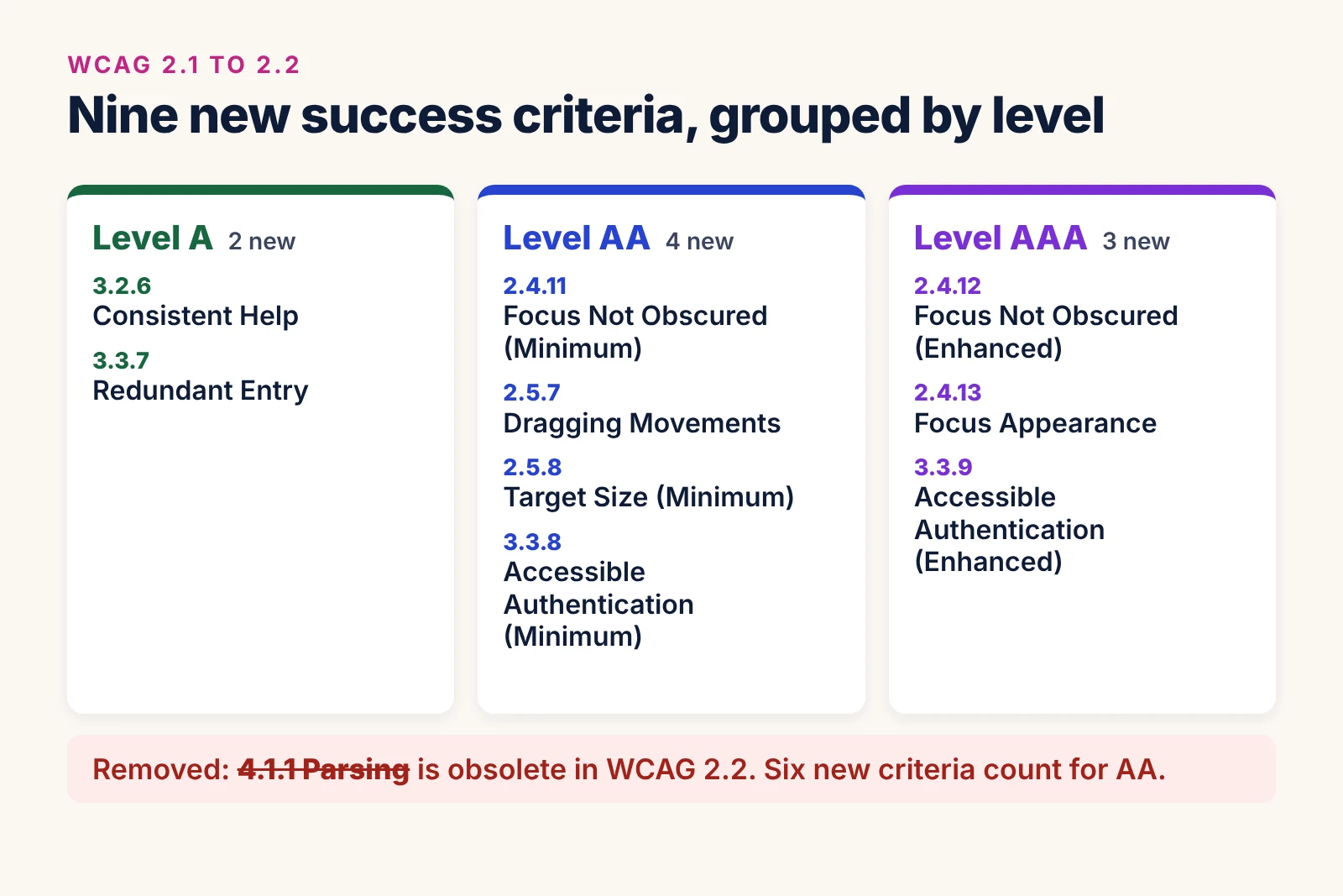
One success criterion was also removed. 4.1.1 Parsing is marked obsolete in WCAG 2.2, because modern browsers and screen readers no longer break on small HTML errors like duplicate attributes. That does not mean messy HTML is fine. Duplicate IDs that break a label or an aria-labelledby link are still failures, now under 1.3.1 Info and Relationships or 4.1.2 Name, Role, Value.
Another change is easy to miss. 2.4.7 Focus Visible moved from Level AA to Level A, so a missing focus outline is now a more basic failure than before.
Do you need WCAG 2.2 for ADA, Section 508 and the EAA?
Short answer: most laws still point to an older version, but WCAG 2.2 AA is the safest target. Here is where things stand:
- ADA Title II (US public bodies): the Department of Justice rule names WCAG 2.1 Level AA. Our ADA Title II website compliance page covers the deadlines.
- ADA Title III (US businesses): there is no written web standard, but demand letters and settlements now often mention WCAG 2.1 or 2.2 AA.
- Section 508 (US federal): still references WCAG 2.0 AA.
- European Accessibility Act: works through the EN 301 549 standard, which currently maps to WCAG 2.1 AA and is being updated. See our guide to the European Accessibility Act.
WCAG versions are built to be backward compatible. A site that meets WCAG 2.2 AA also meets 2.1 AA and 2.0 AA in practice. So one WCAG 2.2 audit covers every one of these laws, and you will not need to redo the work when the standards catch up.
The 9 new WCAG 2.2 success criteria and how to fix them
Below, each criterion has a plain explanation, a common failure we find in audits, a fix, and a quick way to test it. The level is shown next to each name.
2.4.11 Focus Not Obscured (Minimum), Level AA
When a keyboard user tabs to a link or button, it must not be completely hidden by something else on the page that you added. The usual cause is a sticky header, a sticky footer, a chat widget or a cookie banner. The user presses Tab, focus moves to "Pay now", but the button sits underneath the banner and they have no idea where they are.
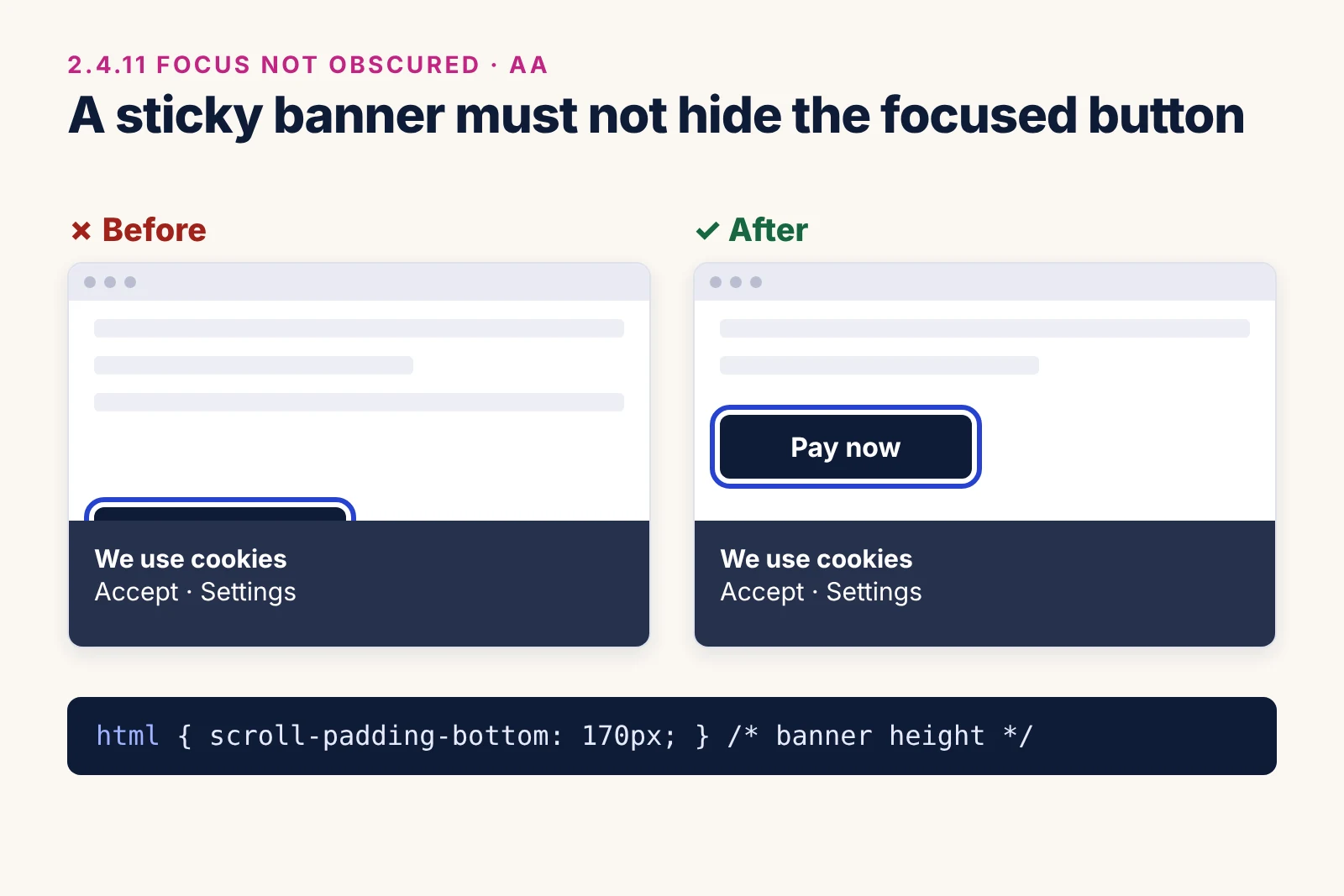
The cleanest fix is CSS scroll-padding. It tells the browser to keep focused items clear of the fixed areas when it scrolls them into view:
html {
  /* sticky header height */
  scroll-padding-top: 90px;
  /* cookie banner height */
  scroll-padding-bottom: 170px;
}
Also make sure the cookie banner can be dismissed with the keyboard, and does not cover the page for ever. How to test: put the mouse away and Tab through every page with the banner still open and the header sticky. If at any point you cannot see where focus is, it fails.
2.4.12 Focus Not Obscured (Enhanced), Level AAA
This is the stricter version. No part of the focused item may be hidden, not even a corner. The same scroll-padding fix usually solves both, with a little extra space added.
2.4.13 Focus Appearance, Level AAA
This criterion sets a minimum size and contrast for the focus indicator itself. In simple terms, the outline should be at least as big as a 2 CSS pixel border around the element, and the change in colour between focused and not focused should have a contrast ratio of at least 3:1. Even though it is AAA, it is the easiest one to meet, and we recommend it for every site:
a:focus-visible,
button:focus-visible,
input:focus-visible,
select:focus-visible,
textarea:focus-visible {
  outline: 3px solid #1a4fd6;
  outline-offset: 2px;
}
2.5.7 Dragging Movements, Level AA
Anything that needs a drag, such as reordering a list, moving a slider handle, or dropping a file onto a box, must also work with a single click or tap, unless dragging is essential. Many people with tremors, limited hand movement or a head pointer cannot hold and drag reliably.
The fix is to add simple buttons next to the draggable item. For a sortable list it looks like this:
<li>
  Weekly report
  <button type="button">Move up<span class="visually-hidden">: Weekly report</span></button>
  <button type="button">Move down<span class="visually-hidden">: Weekly report</span></button>
</li>
For a range slider, a native <input type="range"> already supports clicking on the track, and an "upload file" button is enough next to a drop zone. How to test: try to complete each drag action without dragging, using only clicks or taps.
2.5.8 Target Size (Minimum), Level AA
Every clickable target must be at least 24 by 24 CSS pixels, or have enough space around it. The spacing rule is the part people miss: a smaller icon still passes if a 24 pixel circle centred on it does not overlap another target or that target's circle.
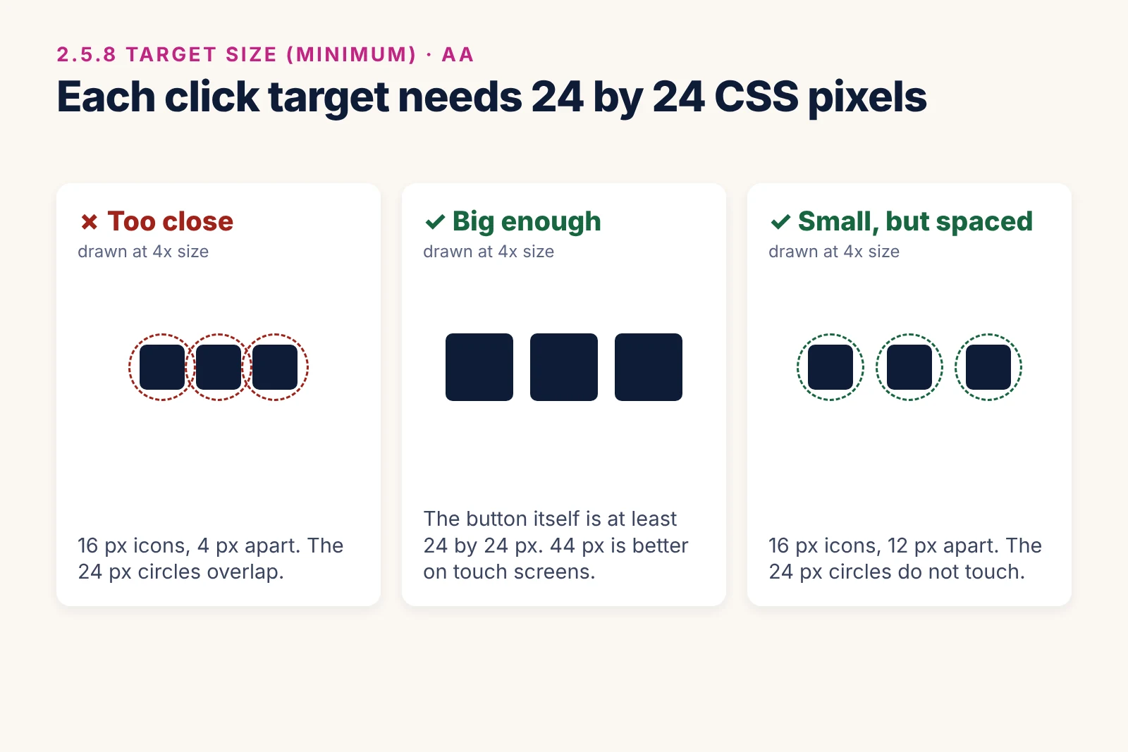
The failures we see most are social media icons in the footer, "x" close buttons on pop-ups, small pagination numbers and icon links packed close together. The fix is to give the link itself a minimum size, without changing the icon:
.icon-link {
  display: inline-flex;
  align-items: center;
  justify-content: center;
  min-width: 24px;
  min-height: 24px;
}
Links inside a sentence are an exception, as are targets whose size is set by the browser. We still recommend 44 by 44 pixels for main buttons on mobile, because 24 pixels is only the minimum.
3.2.6 Consistent Help, Level A
If your site offers help on several pages, such as a phone number, contact link, chat button or FAQ link, it must appear in the same place relative to other content on each page. A "Contact us" link that sits in the header on one page and moves to the bottom of a sidebar on another fails. The easy fix is to keep help in one shared template part, usually the header or footer, so it never moves.
3.3.7 Redundant Entry, Level A
In a multi-step process, users should not have to type the same information twice. If someone enters their delivery address on step one, the billing step should fill it in for them or let them select it. Exceptions are when re-entry is essential, such as confirming a new password, or needed for security.
<input type="checkbox" id="same-address" checked>
<label for="same-address">Billing address is the same as delivery address</label>
Adding the right autocomplete values to name, email, phone and address fields also helps a lot, even though browser autofill alone does not meet this criterion.
3.3.8 Accessible Authentication (Minimum), Level AA
Logging in must not depend on a "cognitive function test", such as remembering a password, solving a puzzle or copying distorted characters, unless there is an easier option or a way to get help. In real life this means two things: let people paste and let password managers fill the password, and do not use text CAPTCHAs without an alternative.
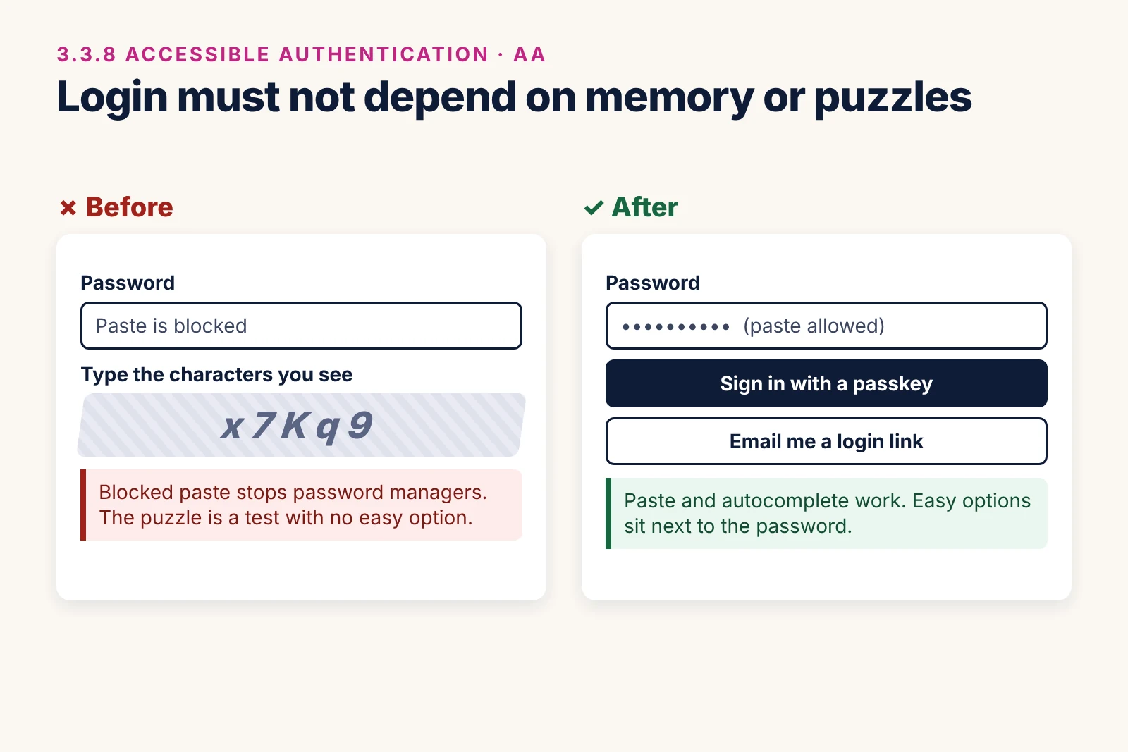
The most common failure is code that blocks paste on the password field. Remove it, and give the fields the right autocomplete values:
<!-- Remove onpaste="return false" -->
<label for="user">Email</label>
<input type="email" id="user" name="email" autocomplete="username">
<label for="pw">Password</label>
<input type="password" id="pw" name="password" autocomplete="current-password">
Passkeys, email login links and one-time codes that can be pasted are all good extra options. A CAPTCHA that asks the user to recognise common objects is allowed at AA, but it is still a barrier for many people. Our free Ananyoo Accessible Login plugin for WordPress shows this in practice, with paste allowed and a show or hide password toggle.
3.3.9 Accessible Authentication (Enhanced), Level AAA
The stricter version removes the two exceptions. Even object recognition puzzles and "pick your own photo" checks are not allowed unless there is another option.
How to test your website for WCAG 2.2
Automated scanners can only catch a small part of WCAG 2.2. They can measure some target sizes, but they cannot tell whether focus is hidden behind a banner, or whether a drag action has a button alternative. Use this quick manual check alongside your usual testing:
- Tab through each key page with the cookie banner open and the header sticky. Focus must always be visible.
- Look for small icons, close buttons and pagination links, and check them against the 24 pixel rule.
- Try every drag feature, slider and drop zone using only clicks or taps.
- Open three or four pages and check that the help or contact link is in the same place.
- Go through checkout or a long form and note any information you have to type twice.
- Log in with a password manager and try pasting the password. Then check for text CAPTCHAs.
Then test with real screen readers as well. Our screen reader testing guide covers JAWS, NVDA, VoiceOver and TalkBack, and our WCAG checklist lists the full set of WCAG 2.2 AA checks.
Common WCAG 2.2 mistakes we see in audits
- Assuming a 2.1 audit is still enough: a WCAG 2.1 report does not cover the six new A and AA checks.
- Fixing the banner but not the header: sticky headers hide focus just as often as cookie banners, especially when a user tabs backwards.
- Making icons bigger but not the link: the clickable area is what counts, not the icon drawing.
- Blocking paste "for security": it adds no real security and fails 3.3.8.
- Relying on an overlay: a toolbar cannot change how your login, banner or forms work. We explain why in accessibility overlays: pros and cons explained.
WCAG 2.2 on popular platforms
The new criteria show up in slightly different places depending on the platform. Here is where we usually find them:
- WordPress and WooCommerce: sticky headers in page builders, cookie plugins that cover focus, tiny social icons in footers, and checkout forms that ask for the address twice. See our guides to WordPress and WooCommerce compliance.
- Shopify: slide-out cart drawers, quantity buttons under 24 pixels, and announcement bars that hide focus. Our Shopify ADA compliance guide covers the theme side.
- BigCommerce and Magento (Adobe Commerce): mega menus, product image carousels with drag-only swipe, and long checkout steps. Read our BigCommerce and Magento guides.
- Drupal: exposed Views filters with small controls and custom login forms. Our Drupal ADA compliance guide explains the fixes.
The fixes are the same everywhere: CSS for focus and target size, a button alternative for every drag action, one shared place for help links, and forms that remember what the user already typed. What changes is the file you edit, whether that is a theme template, a Liquid section or a Twig file.
How Ananyoo can help you meet WCAG 2.2
I am Shivaji Mitra, a DHS Trusted Tester, and our audit team is IAAP certified. We test against WCAG 2.2 AA by hand with keyboard, screen readers, zoom and real mobile devices, then fix the problems in your theme, forms and templates.
Our own products are built to WCAG 2.2 AA too. The Ariade accessible themes for WordPress, Shopify and BigCommerce, and our free WordPress accessibility plugins for carousels, forms, login, events and portfolios, already handle visible focus, target sizes and accessible login.
If you need help, start with a website accessibility audit, then accessibility remediation, and a VPAT or conformance report if your buyers ask for one. Send your website address through our contact page, and you will get a written reply within one working day.
Frequently asked questions
Is WCAG 2.2 legally required?
Most laws still name WCAG 2.1 AA or 2.0 AA. WCAG 2.2 AA is backward compatible and is the version buyers and testers now expect, so meeting it covers all of them.
How many new success criteria are in WCAG 2.2?
Nine: two at Level A, four at Level AA and three at Level AAA. 4.1.1 Parsing was removed.
What is the WCAG 2.2 target size?
At Level AA, clickable targets must be at least 24 by 24 CSS pixels, or have enough spacing so that a 24 pixel circle on each target does not overlap another.
Does WCAG 2.2 ban CAPTCHA?
Not completely. At Level AA, a text or puzzle CAPTCHA needs an easier alternative, while object recognition CAPTCHAs are allowed. At Level AAA, they all need an alternative.
Is WCAG 3.0 replacing WCAG 2.2?
Not yet. WCAG 3.0 is still a working draft and is years away. Read our WCAG 3.0 update for more. For now, WCAG 2.2 AA is the standard to meet.
